In the previous chapter we created a simple page with one visual element only. If you want to layout multiple elements, Xamarin.Forms provides four possibilities:
- A StackLayout aligns multiple child elements along one dimension, either horizontally or vertically.
- A Grid allows for aligning visual elements in a grid-like structure.
- A RelativeLayout provides constraints between position and/or size of its child elements.
- An AbsoluteLayout allows you to specify absolute coordinates of each element.
2.1 Comparison of Xamarin.Forms layouts
In the following example we will create a page with four content blocks, each built with one of these layouts. The visual appearance will be almost identical, but the implementation will be conceptually different.
The StackLayout – probably the most common layout in Xamarin.Forms – serves as the main layout containing the four blocks. With a platform-dependent padding the MainPage looks as follows:
MainPage = new ContentPage {
Padding = new Thickness(0, Device.OS == TargetPlatform.iOS ? 20 : 0, 0, 0),
Content = new StackLayout {
Children = {
new DemoStackLayout(),
new DemoGrid(),
new DemoRelativeLayout(),
new DemoAbsoluteLayout(),
},
},
};
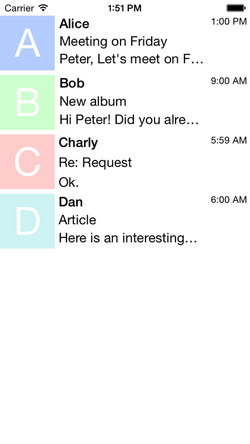
The screenshot shows an overview of the final result. The “inbox” contains four item blocks, each with icon, name, subject, body and time. Before looking into each of the four layouts, we define classes for the single visual elements.
The StackLayout – probably the most common layout in Xamarin.Forms – serves as the main layout containing the four blocks. With a platform-dependent padding the MainPage looks as follows:
MainPage = new ContentPage {
Padding = new Thickness(0, Device.OS == TargetPlatform.iOS ? 20 : 0, 0, 0),
Content = new StackLayout {
Children = {
new DemoStackLayout(),
new DemoGrid(),
new DemoRelativeLayout(),
new DemoAbsoluteLayout(),
},
},
};
The screenshot shows an overview of the final result. The “inbox” contains four item blocks, each with icon, name, subject, body and time. Before looking into each of the four layouts, we define classes for the single visual elements.
The Icon is a Label with large, white, centered text on a colored background. Text and color are passed to the constructor as arguments.
public class Icon: Label
{
public Icon(string text, Color color)
{
Text = text;
TextColor = Color.White;
FontSize = 50;
BackgroundColor = color;
HorizontalTextAlignment = TextAlignment.Center;
VerticalTextAlignment = TextAlignment.Center;
}
}
The Name is a Label with bold text.
public class Name: Label
{
public Name(string text)
{
Text = text;
FontAttributes = FontAttributes.Bold;
}
}
The Subject features a special truncation mode. Otherwise the possibly long string might not fit on the small mobile screen.
public class Subject: Label
{
public Subject(string text)
{
Text = text;
LineBreakMode = LineBreakMode.TailTruncation;
}
}
The Body is actually identical to the Subject class. It is, however, reasonable to implement the extra class to allow for easy modifications later on, e.g. changing the text color of all subjects.
public class Body: Label
{
public Body(string text)
{
Text = text;
LineBreakMode = LineBreakMode.TailTruncation;
}
}And last but not least, the Time is a simple Label with rather small font size.
public class Time: Label
{
public Time(string text)
{
Text = text;
FontSize = 12;
}
}
Note that Xamarin.Forms provides fields like HorizontalOptions and VerticalOptions as mentioned in the previous chapter. But here we restrict to specifying internal element properties only and leave the layout up to the wrapping layout classes.
Stack layout
The first block on our MainPage is a DemoStackLayout. It is derived from StackLayout, probably the most common layout in Xamarin.Forms. Since it allows stacking elements in one direction only, we need to combine multiple stacks hierarchically to obtain the desired result.
Like the main direction of one “email” block the DemoStackLayout is oriented horizontally. The HeightRequest is 70 device-independent pixels, specifying the total height of the whole block. A Spacing of 5 pixels is almost identical to the default of 6 pixels.
Now we add three children: the Icon, another StackLayout and the Time label. We pass arguments like text and color to the constructors and set additional properties like the WidthRequest for Icon and Time.
public class DemoStackLayout: StackLayout
{
public DemoStackLayout()
{
HeightRequest = 70;
Spacing = 5;
Orientation = StackOrientation.Horizontal;
Children.Add(new Icon("A", Color.FromRgb(0.7, 0.8, 1.0)) {
WidthRequest = 70,
});
Children.Add(new StackLayout {
Spacing = 2,
WidthRequest = 0,
HorizontalOptions = LayoutOptions.FillAndExpand,
Children = {
new Name("Alice"),
new Subject("Meeting on Friday"),
new Body("Peter, Let's meet on Friday at 10 am"),
},
});
Children.Add(new Time("1:00 PM") {
WidthRequest = 50,
});
}
}
The nested StackLayout is oriented vertically (the default behavior) and has some tiny Spacing between its child elements. Zero WidthRequest and HorizontalOptions with expansion lets it occupy the available horizontal space – but not more. See this section for a more detailed explanation of Xamarin.Forms LayoutOptions.
Note that the square shape of the icon is ensured by explicitly setting its WidthRequest to the same value like the blocks HeightRequest. Don’t try to refer to the Width or Height properties of visual elements within the constructor. The element size will only be defined after adding the element to its parent and completing the (rather complex) Xamarin.Forms layout cycle.
Grid layout
In contrast to a StackLayout, the Grid allows for stacking content in two dimensions. And while a StackLayout is refined with nested layouts where needed, content of a fine-grained Grid can span multiple cells.
Our DemoGrid has the same HeightRequest and spacings like the DemoStackLayout. Before adding the five child elements, we only need to define rows and columns. This is done via a RowDefinitionCollection and a ColumnDefinitionCollection. A RowDefinition or ColumnDefinition can have a pre-defined Height or Width, respectively. Per default, the space is divided equally. We only specify the width of the first and last column, which is the Icon and the Time label. Note that the RowDefinitions with three equally sized rows is the default and can be neglected. The number of rows or columns would then be automatically derived from the children added afterwards.
Those child elements are identical to the ones added to the DemoStackLayout. Only the Add method is different: It allows specifying the grid cell coordinates (left, top) or even a range of cells (left, right, top, bottom). In our example only the Icon spans multiple cells, namely all three rows of the first column.
public class DemoGrid: Grid
{
public DemoGrid()
{
HeightRequest = 70;
RowSpacing = 2;
ColumnSpacing = 5;
RowDefinitions = new RowDefinitionCollection {
new RowDefinition(),
new RowDefinition(),
new RowDefinition(),
};
ColumnDefinitions = new ColumnDefinitionCollection {
new ColumnDefinition{ Width = new GridLength(70) },
new ColumnDefinition(),
new ColumnDefinition{ Width = new GridLength(50) },
};
Children.Add(new Icon("B", Color.FromRgb(0.8, 1.0, 0.8)), 0, 1, 0, 3);
Children.Add(new Name("Bob"), 1, 0);
Children.Add(new Subject("New album"), 1, 1);
Children.Add(new Body("Hi Peter! Did you already listened to the new album..."), 1, 2);
Children.Add(new Time("9:00 AM"), 2, 0);
}
}
Relative layout
After defining HeightRequest and both spacings as for the previous layouts, we make sure to set a non-expanding layout option using LayoutOptions.Start. Now it is reasonable to store all five elements into local variables, which we can refer to later. When adding them to the RelativeLayout, we can define functional constraints for their location and size. While we define width and height of the icon relatively to the parent layout l, the location of name, subject and body is defined relatively to other views v. So the name starts at the right edge of icon with some spacing and subject and body follow below. The time label is aligned to the right with a fixed width.
public class DemoRelativeLayout: RelativeLayout
{
public DemoRelativeLayout()
{
HeightRequest = 70;
const int xSpacing = 5;
const int ySpacing = 2;
VerticalOptions = LayoutOptions.Start;
var icon = new Icon("C", Color.FromRgb(1.0, 0.8, 0.8));
var name = new Name("Charly");
var subject = new Subject("Re: Request");
var body = new Body("Ok.");
var time = new Time("5:59 AM");
Children.Add(icon,
widthConstraint: Constraint.RelativeToParent(l => l.Bounds.Height),
heightConstraint: Constraint.RelativeToParent(l => l.Bounds.Height));
Children.Add(name,
xConstraint: Constraint.RelativeToView(icon, (l, v) => v.Bounds.Right + xSpacing));
Children.Add(subject,
xConstraint: Constraint.RelativeToView(name, (l, v) => v.Bounds.Left),
yConstraint: Constraint.RelativeToView(name, (l, v) => v.Bounds.Bottom + ySpacing));
Children.Add(body,
xConstraint: Constraint.RelativeToView(subject, (l, v) => v.Bounds.Left),
yConstraint: Constraint.RelativeToView(subject, (l, v) => v.Bounds.Bottom + ySpacing));
Children.Add(time,
xConstraint: Constraint.RelativeToParent(l => l.Bounds.Right - 50),
widthConstraint: Constraint.Constant(50));
}
}
Absolute layout
The AbsoluteLayout is probably the most powerful layout. It allows you to specify absolute coordinates for all child elements. This might be an advantage for arbitrarily arranged elements, but can also be tedious if one of the previous layouts roughly matches the underlying structure.
Besides specifying the HeightRequest and horizontal spacing we pre-compute the width of the block with name, subject and body. To fill the available horizontal space completely, we need to refer to the screen width. In the next section we will describe in more detail, how to work with the screen size in the cross-platform code.
Now we add all five child elements, each with a Rectangle describing its layout bounds. The numbers represent left, top, width and height.
public class DemoAbsoluteLayout: AbsoluteLayout
{
public DemoAbsoluteLayout()
{
HeightRequest = 70;
const int xSpacing = 5;
var centerWidth = App.ScreenWidth - 70 - 50 - 2 * xSpacing;
Children.Add(new Icon("D", Color.FromRgb(0.8, 0.95, 0.95)), new Rectangle(0, 0, 70, 70));
Children.Add(new Name("Dan"), new Rectangle(70 + xSpacing, 0, centerWidth, 23));
Children.Add(new Subject("Article"), new Rectangle(70 + xSpacing, 23, centerWidth, 23));
Children.Add(new Body("Here is an interesting article."), new Rectangle(70 + xSpacing, 46, centerWidth, 23));
Children.Add(new Time("6:00 AM"), new Rectangle(70 + centerWidth + 2 * xSpacing, 0, 50, 70));
}
}
While this implementation is very compact, it is nontrivial to read and to modify. Adding another element or changing some geometric property is difficult, since it would affect many lines of code. But whenever other layouts struggle to reproduce the desired content structure, an AbsoluteLayout is a reliable fallback solution.

