|
In Windows Phone or Windows Store apps, you might have already used the VisualStateManager (VSM) to handle the orientation of the device. This can be used to create a different layout in portrait or landscape mode. Similarly, we were also often using the VSM to handle split mode versus full screen mode in Windows Store apps. The user would grip the bar between two apps, move it and when a certain threshold was reached, the new state would kick in and controls were moved around, hidden and shown, etc. For example, we typically use a GridView in full screen mode (with horizontal scrolling) and a ListView (vertical) in split mode when the layout is narrow. In Windows 10, a similar technique is possible but it has been improved. The first improvement is that you can now define triggers for your UI. No it’s not the good old Windows Presentation Foundation triggers, but the purpose is similar. Another great improvement is that the VSM now supports Setters instead of having to create an animation for each single state. While it is still possible to transition between states with an animation, the need to create a 0-second animation for static state changes is now obsolete. This produces a much cleaner XAML markup. For example, create a new Windows 10 universal application and open the MainPage.xaml. Then add the following XAML markup: <Grid x:Name="LayoutRoot"> <VisualStateManager.VisualStateGroups> <VisualStateGroup> <VisualState x:Name="WideState"> <VisualState.StateTriggers> <AdaptiveTrigger MinWindowWidth="600" /> </VisualState.StateTriggers> <VisualState.Setters> <Setter Target="LayoutRoot.Background" Value="Green" /> </VisualState.Setters> </VisualState> <VisualState x:Name="NarrowState"> <VisualState.StateTriggers> <AdaptiveTrigger MinWindowWidth="0" /> </VisualState.StateTriggers> <VisualState.Setters> <Setter Target="LayoutRoot.Background" Value="Red" /> </VisualState.Setters> </VisualState> </VisualStateGroup> </VisualStateManager.VisualStateGroups> </Grid> As you can see on line 2, we define the VisualStateManager’s VisualStateGroups. On line 4 we add a new state named WideState, with a trigger named AdaptiveTrigger on line 6. This trigger will kick in when the window is 600 pixels or larger, and the corresponding WideState will be applied. On line 15, we define another state named NarrowState, and use another AdaptiveTrigger. Here, we specify that this trigger applies for sizes larger than 0 pixel (in effect, it means that the NarrowState will apply between 0 and 600 pixels). At this point, the AdaptiveTrigger is the only available trigger for Windows 10. However nothing prevents you from creating your own triggers, like my good friend Morten Nielsen shows in his article “Using Custom Visual State Triggers”. For example you can think of a trigger for the device orientation, the pixel depth (DPI), the physical screen size, etc. If you run the code now, you will see that the change between NarrowState and WideState is seamless, i.e it appears while the user is resizing the window, not only after he lets the mouse cursor go like in Windows 8. This is an obvious improvement in the user experience. 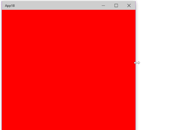 Combining VSM and RelativePanelOften it is interesting to adapt the layout of your UI depending on the window’s width (or other parameters). We could do that using a Grid (probably the most versatile panel available), but here I would like to introduce a new panel named RelativePanel. This will sound very familiar to Android developers where the RelativeLayout panel is super useful. But in fact the Windows 10 RelativePanel’s real power is even more obvious when coupled to the VSM. For example, let’s create the following UI when the window is larger than 600 px: 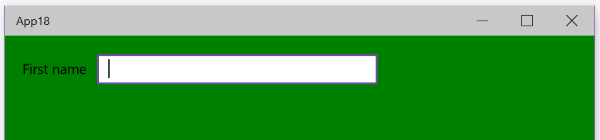 On the other hand, if the windows is smaller than 600 px, we want the elements to appear vertically, as shown here: 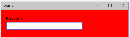 To do this, we will start by adding a RelativePanel to our main Grid as shown here: <RelativePanel HorizontalAlignment="Stretch" Margin="20"> <TextBlock Text="First name" x:Name="FirstNameLabel" Margin="0,5,10,5"/> <TextBox x:Name="FirstNameText" Width="300" /> </RelativePanel> Notice that in the code snippet above, I have not defined any relative position for the elements. If you were to run the code now, you would see only the TextBox because it appears on top of the TextBlock. As such, the RelativePanel acts as a Grid. In the VSM, we can now extend the existing markup to specify where the UI elements must appear in the WideState: <VisualState x:Name="WideState"> <VisualState.StateTriggers> <AdaptiveTrigger MinWindowWidth="600" /> </VisualState.StateTriggers> <VisualState.Setters> <Setter Target="LayoutRoot.Background" Value="Green" /> <Setter Target="FirstNameText.(RelativePanel.RightOf)" Value="FirstNameLabel" /> </VisualState.Setters> </VisualState> In the NarrowState however, we want the TextBox to appear below the TextBlock. <VisualState x:Name="NarrowState"> <VisualState.StateTriggers> <AdaptiveTrigger MinWindowWidth="0" /> </VisualState.StateTriggers> <VisualState.Setters> <Setter Target="LayoutRoot.Background" Value="Red" /> <Setter Target="FirstNameText.(RelativePanel.Below)" Value="FirstNameLabel" /> </VisualState.Setters> </VisualState> Note the usage of parenthesis around the “RelativePanel.RightOf” and “RelativePanel.Below” properties. This is needed because RightOf and Below are attached properties defined by the RelativePanel class. This is similar to the well known Grid.Column/Grid.Row properties, or Canvas.Top/Canvas.Left, etc. Running the code now will show the UI rendered like we wanted. 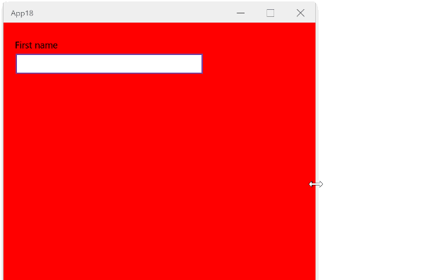
Thank You our MVP share the Slide about Windows 10 on Rasberry Pi 2
Thank You our MVP shared the slide about Windows Developer Program for IoT
For more details, please read the accompanying blog:http://blogs.msdn.com/b/lucian/archive/2015/06/09/win10-apps-in-net-porting-from-8-1-universal-to-win10.aspx
|

Archives
June 2020
Categories
All
|
Photos used under Creative Commons from derkamener1984, justgrimes
