DatePicker
The DatePicker is a new control that lets you pick a single date (month, day, year). Basically, it’s composed of three comboboxes you can format the way you want with these three string properties: MonthFormat, DayFormat,YearFormat.
<DatePicker MonthFormat="{}{month.full}"
DayFormat="{}{day.integer} ({dayofweek.abbreviated})"
YearFormat="{}{year.full}"/>
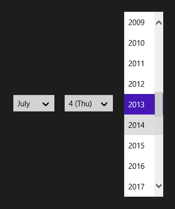
The string format is quite unusual, but IntelliSense helps you pick the format you want.
If, for any reason, you want to hide the month, day or year combobox, you can use the MonthVisible, DayVisibleand YearVisible properties.
You can also add a header to the picker with the Header property.
If, for any reason, you want to hide the month, day or year combobox, you can use the MonthVisible, DayVisibleand YearVisible properties.
You can also add a header to the picker with the Header property.

Below are some other useful properties:
Finally, if you want to get or set the date programmatically, you can use the Date property of type DateTimeOffsetvalue.
- CalendarIdentifier : used to define the calendar system to use (Gregorian, Hebrew, Japanese, …)
- Orientation : vertical or horizontal (default value)
- MinYear / MaxYear : used to set the min and max year value
Finally, if you want to get or set the date programmatically, you can use the Date property of type DateTimeOffsetvalue.

