On of the most powerful features of Xamarin.Forms is its capability of working with natively implemented extensions of its default elements. If we wish to modify a visual element in some way or add new properties, we can derive a custom renderer with a platform-specific implementation. This can involve a custom visualization or even custom gesture-based user interaction.
3.1 A custom label renderer
In this example we will extend the Label element by a border color, border width and a corner radius for rounded corners. After discussing the platform-independent code of this CustomLabel, we will look into the corresponding iOS and Android renderer.
The platform-independent shared codeAs mentioned above, the CustomLabel is derived from Label with three new properties: a border color, a border width and a corner radius:
public class CustomLabel: Label
{
public Color BorderColor { get; set; }
public double BorderWidth { get; set; }
public double CornerRadius { get; set; }
}
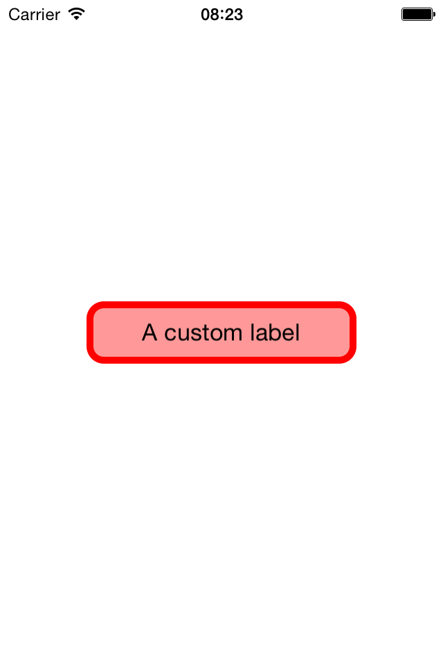
Within the constructor of the App class we place a new CustomLabel on the MainPage. Besides the default properties like Text and BackgroundColor we can assign our new properties as well.
MainPage = new ContentPage {
Content = new CustomLabel {
Text = "A custom label",
BackgroundColor = Color.Red.WithLuminosity(0.8),
BorderColor = Color.Red,
BorderWidth = 5,
CornerRadius = 10,
HorizontalOptions = LayoutOptions.CenterAndExpand,
VerticalOptions = LayoutOptions.CenterAndExpand,
WidthRequest = 200,
HeightRequest = 50,
HorizontalTextAlignment = TextAlignment.Center,
VerticalTextAlignment = TextAlignment.Center,
},
};
The layout options, size requests and alignments are just for centering the label on the page, enforcing a certain element size and centering the label text within the element bounds.
So far, the CustomLabel is derived from Label and will be displayed as such, i.e. with neither rounded corners nor a visible border. But in the next step we will override the corresponding iOS and Android renderers with a custom implementation considering all newly introduced properties.
The iOS rendererA custom renderer needs to be implemented in the platform-specific project. Therefore, we add a new class CustomLabelRenderer to the iOS project.
The first thing we need to tell the compiler is that this will be the renderer associated with our CustomLabel:
[assembly:ExportRenderer(typeof(CustomLabel), typeof(CustomLabelRenderer))]
Sometimes a custom renderer only redefines some properties within the constructor. But in this case, we override the Draw method. Within the current drawing context we clear the canvas and then draw a rounded rectangle. These two methods are defined below.
public override void Draw(CGRect rect)
{
using (var context = UIGraphics.GetCurrentContext()) {
ClearCanvas(context, rect);
FillRoundedRect(context, rect);
}
}On iOS it is required to clear the canvas by filling the rectangular area with white color. Otherwise we would see a black background.
static void ClearCanvas(CGContext context, CGRect rect)
{
context.SetFillColor(Color.White.ToCGColor());
context.FillRect(rect);
}
Drawing with “Core Graphics” – as indicated by the letters CG at some class names – usually works as follows: First we need to assign several properties like color, line width or stroke color of the current context. Then we add a new path representing the shape we want to draw. And finally we call DrawPath to actually draw the shape to the canvas.
Note that we need to convert the Xamarin.Forms color White using the method ToCGColor before using it within the Core Graphics context.
The very same pattern is used to draw a filled rounded rectangle. To access properties of our CustomLabel, we can use the Element member. Since the CustomLabelRenderer is derived from LabelRenderer, Elementis already of type Label and can be cast to CustomLabel to get access to custom properties like CornerRadius or BorderWidth.
void FillRoundedRect(CGContext context, CGRect rect)
{
var label = Element as CustomLabel;
var radius = (float)label.CornerRadius;
var width = (float)label.BorderWidth;
context.SetLineWidth(width);
context.SetStrokeColor(label.BorderColor.ToCGColor());
context.SetFillColor(label.BackgroundColor.ToCGColor());
context.AddPath(CGPath.FromRoundedRect(rect.Inset(width, width), radius, radius));
context.DrawPath(CGPathDrawingMode.FillStroke);
}
Note the method Inset: It creates a rectangle that is width pixels smaller then rect. Insetting the original rectangle is necessary in order to completely see the wide border on the canvas.
The Android rendererIn principle, implementing custom renderers on Android is very similar to iOS. The native drawing library, however, is slightly different.
To connect our CustomLabel with the CustomLabelRenderer for Android, the assembly attribute is identical to iOS. So we add a new class to the Android project and paste the following line:
[assembly:ExportRenderer(typeof(CustomLabel), typeof(CustomLabelRenderer))]
In contrast to iOS, we need to tell the Android renderer to actually call its Draw method by disabling SetWillNotDraw:
public CustomLabelRenderer()
{
SetWillNotDraw(false);
}
Now we can override the Android Draw method. The Android renderer has an Element field as well, which allows us to access the visual element we need to draw. Here, we get a Canvas object, which works similar to the context on iOS. For example, it has a ClipBounds property describing the accessible drawing area. We will draw the label in three steps: First we fill the rectangle, then we draw the border, and finally we draw the label text.
public override void Draw(Canvas canvas)
{
var label = Element as CustomLabel;
var width = (int)label.BorderWidth * Resources.DisplayMetrics.Density;
var radius = (float)label.CornerRadius * Resources.DisplayMetrics.Density;
var rect = new RectF(canvas.ClipBounds);
rect.Inset(width, width);
FillRect(canvas, rect, radius);
DrawStroke(canvas, rect, radius, width);
DrawText(canvas, rect, label.Text);
}
On Android we usually work with a Paint object. It contains information like color, stroke with or whether we want to use anti-aliasing. The latter is a technique to avoid “staircases” when drawing sloped lines and shapes, which generally yields more visually pleasing results at the cost of slightly more computing time. The paint is then passed to the actual drawing method.
void FillRect(Canvas canvas, RectF rect, float radius)
{
var paint = new Paint {
Color = Element.BackgroundColor.ToAndroid(),
AntiAlias = true,
};
canvas.DrawRoundRect(rect, radius, radius, paint);
}
Drawing a stroke works almost identically. We only need to define a StrokeWidth and set the paint style to Stroke. Note that in contrast to accessing the BackgroundColor, which is defined for every Label, we need to cast the Element to our CustomLabel in order to access the new property BorderColor. Furthermore, we need to convert the Xamarin.Forms color to an Android color using the method ToAndroid.
void DrawStroke(Canvas canvas, RectF rect, float radius, float width)
{
var paint = new Paint {
Color = (Element as CustomLabel).BorderColor.ToAndroid(),
StrokeWidth = width,
AntiAlias = true,
};
paint.SetStyle(Paint.Style.Stroke);
canvas.DrawRoundRect(rect, radius, radius, paint);
}
The Paint class even has properties for drawing text. Thus, we can define the TextSize – using the display Density to convert from device-independent pixels to device-dependent pixels.
void DrawText(Canvas canvas, RectF rect, string text)
{
var paint = new Paint {
TextSize = (float)Element.FontSize * Resources.DisplayMetrics.Density,
};
var position = CenterText(paint, rect, text);
canvas.DrawText(text, position.X, position.Y, paint);
}
Drawing text at the correct position can get rather tricky, especially centering it on a given rectangular area. We can control horizontal alignment via the TextAlign property of the Paint class. But there is no such property for vertical alignment. Therefore, we suggest the method CenterText: It measures the bounds of a text with a given paint and computes the top left corner position as an offset to the center of the given drawing rectangle rect.
static PointF CenterText(Paint paint, RectF rect, string text)
{
var bounds = new Rect();
paint.GetTextBounds(text, 0, text.Length, bounds);
return new PointF(
rect.CenterX() - bounds.Width() / 2,
rect.CenterY() + bounds.Height() / 2);
}